Thursday, October 27, 2011

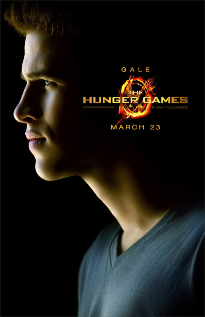
The Hunger Games character posters revealed!

Of course we are probably months away from a Hunger Games outdoor advertising campaign, but here's a little snacketizer for you THG fans. Lionsgate revealed a string of character posters today, and I couldn't wait to comment on them.

The Hunger Games character poster Peeta Josh Hutcherson
The Hunger Games character poster Katniss Jennifer Lawrence
The Hunger Games character poster Effie Elizabeth Banks
The Hunger Games character poster Rue Amandla Stenberg
The Hunger Games character poster Gale Liam Hemsworth
The Hunger Games character poster Cato Alexander Ludwig
The Hunger Games character poster Haymitch Woody Harrelson
The Hunger Games character poster Cinna Lenny Kravitz

Clearly Katniss (the protagonist for those unfamiliar) is set apart from the rest in a brilliant and subtle way. Pretty awesome when you can see that the designers of a campaign have really put a lot of thought into it. (When something looks great it's obviously to the credit of the designers; when something looks terrible, it's because the execs made them do it. Right designers?)

I also do like the new logo, only slightly tweaked from the book cover. But at this size, the mockingjay is too obscured by the angle and the flames to even see what it is. They should have chosen one feature or the other, and I'd say the flames. I also wish it didn't look like the title was stabbing Peeta and Cato in the eye.

(So good of those websites with exclusives to put their dirty little watermarks on the images. I'd like to thank the fine folks at Yahoo! Movies, MTV Hollywood Crush, Moviefone, MSN's The Hitlist, and Fandango for not thinking that Lionsgate giving them an exclusive means they own the image. Also to Coming Soon for originally compiling them.)

Commentary that includes SPOILERS after the jump.
Wednesday, October 26, 2011

Go Bully Free

Go bully free, Hollywood: build extravagant impractical housing.


Not sure what Extreme Makeover: Home Edition has to do with bullying, or Hollywood, but I like the composition of this billboard, and I suppose it is a good message.

And don't forget the taco bed. Kids love taco beds.

Monday, October 17, 2011

The Top Ten Uniforms in College Football, Pt. 2

And you thought I wasn't going to finish it.

8. Texas A&M

The Aggies are the first of many teams in this countdown that feature a classic collegiate look, but that's only because that is the best thing there is. Even in the current state of college football uniform design, quite a few teams still choose to stick with tradition (mostly those that win football games), so picking the best tends to ride on a specific quality or qualities that make one team stand out from the pack. A&M looks especially slick when they (rarely) suit up in all-maroon:


But the feature of their uniform that has always stood out to me, and that earns them a spot on this list, is their helmet decal. The design of the logo itself isn't all that special, but just look at the way it dominates the side of the helmet.


It's huge!

Apart from Boise State's terrible one-sided Nike pro combat helmet, it's got to be the biggest in the game.

They do very often run into the problem with chinstraps falling over the logo, though, as seen above. And I could do without the gray outline around the numbers.

On a personal level, I would like wish the Aggies nothing but failure, and may the Oklahoma Sooners send them off on November 5th with an even worse beating than in 2003 (77-0).


7.Arizona

Here's another instance in which the uniforms change so often that it's hard to know what you are rewarding, or in turn, dumping on. Arizona has shown quite a bevy of uniform combos this year:


And those are just the home games. For the most part, these kind of suck. But I just love their all-blue look. Here it is from a year or two ago when they were sporting some unfortunate red piping/striping.


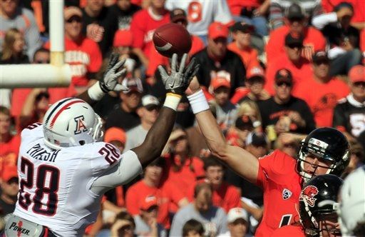
Still, I'd rather that than the new interpretation, which features red-and-white or red-and-blue stripes that fade to white (or blue) in a pixelated dissolve, not unlike a Windows 95 screen saver, on both the pants and the helmets, as you can see on Mr. Parish, below.


But even these can't push the Wildcats off my list, and remain a DISTANT second in the stupid looking pant stripe of the year award.

Coming up next....

A look at how Oklahoma edges out Alabama in uniform design, as well as in winning national championships. (13 is a lie.)

Wednesday, October 12, 2011

The Ides of Smarch


Unfortunately, a few people thought this wasn't a terrible idea, and then a few hundred people had to pretend they were right in order to continue getting paid money. Yikes. I didn't even hate this at first, but it's one of those billboards that grows on you (not in the good way, like a fungus).

Here's the deal, these are two of Hollywood's best man's mans, (Have you seen Michael Clayton? Have you seen Drive?) and somehow the merger of their faces comes off as feminine, and I'm not the only one that thought that.


See? Even @elkress thought that.

I could literally come up with ones of better poster ideas (meaning between two and nine).

Obviously, your first thought goes to the incredible 1993 documentary The War Room, which follows President Clinton's '92 campaign (and also which you can watch in its entirety right here) so why not just go there?


Okay, well I thought the poster would look much cooler than that. But hey, it was the 90's. Still, a pretty good shot of two of the most important behind-the-scenes political figures of the past decade two decades ago, George Stefanopoulos and James Carville. You still could have played on this theme, or if not that, what about these?

  • Some sort of situation room, everyone gathered around a table looking up towards the viewer, sweat on their brows, documents in hand
  • Ryan Gosling lounging on the capital, wearing a top hat, like he's a giant or something
  • George Clooney in a toga (obviously)
  • A moody black-and-white of Clooney and Gosling in front of an American flag. Oh wait...
And yet, this was never seen by anyone.
One thing is certain: this campaign should have done something more to highlight its fantastic cast. Paul Giammati, Philip Seymour Hoffman, Jeffrey Wright, Marissa Tomei, they all got snubbed in favor of a klunky gimmick and yet another terrible photoshop of a hand holding something. (When will they figure out that you can't pose a hand, digitally insert something into it later, and it not look completely unnatural?)

Yikes, again.
Also, a flat image on a curved surface, why is he holding a magazine in front of his face, etc., etc.

You know what you're gonna make me do, The Ides of March? Endorse tiling. That's how bad you are, that some sort of Valentine's Day tiling of acting superstars would have been a better option.


Or what about this?


You got some nuns, some stars. It's not great, but it gets the job done. Instead, we got a George Clooney/Ryan Gosling magazine-face ghost movie poster. The film itself, however, was quality, and if you have the chance to check it out, I recommend it.

The Ides of March billboard photographed by @BenjaminFriday.