Monday, December 12, 2011

Those. Hands.


Can someone please tell me what is so hard about photographing someone with their hands in front of their fucking faces and then putting it on a poster?

The design for this poster is fairly interesting. I'm loving the the title in the box, the general placement of the text, and even the pose of that kid with the extremely annoying demeanor. But literally, if anyone can tell what possible reason a studio or design firm would have for using photoshop to get those fake hands in front of that fake face, I would love to hear it.

Monday, December 5, 2011

Can you spot the six differences between these two pictures?

Maybe it's inevitable that performance capture will one day be recognized as an awardable achievement, but probably not any time soon, probably not against non-digital actors, and most probably not by the Academy.

Slashfilm wrote a feature on this Rise of the Planet of the Apes campaign for consideration:

I would very much like to know why the studio decided to go with this image. It seems wholly counter-intuitive to the campaign. Look at Andy Serkis's mouth - open. Look at Caesar's mouth - closed. They're not making the same expression. How could they? One is a chimp.

No matter how excellent a performance an actor gives (and Serkis's is very excellent) character animators have the ability, and often do make subtle (or not subtle) changes in the performance. How could an awarding body compare digitally altered or created performances to those that aren't?

We've all seen the companion arguments brought about by performance capture. Full chimp make up, full nose make up, computer generated tears, and these Alice in Wonderland screen tests (skip to 0:20 and pay close attention to Alice at 1:20) all raise the question of what is and isn't performance capture. And the questions are no closer to being solved this year by Cesar and his pals.

All this to say, I don't believe for a second that Fox expects Andy Serkis to be nominated. The Academy went through this same issue with Serkis in a more heavily "acted" role, for a movie much more in the Oscar spotlight, Return of the King. But if you want to get awards buzz for your film, a controversial topic like this that gets blogged and reblogged is going to bring a lot more attention than your typical consideration spreads. Kudos for that, I suppose.

Thursday, October 27, 2011

The Hunger Games character posters revealed!

Of course we are probably months away from a Hunger Games outdoor advertising campaign, but here's a little snacketizer for you THG fans. Lionsgate revealed a string of character posters today, and I couldn't wait to comment on them.

The Hunger Games character poster Peeta Josh Hutcherson
The Hunger Games character poster Katniss Jennifer Lawrence
The Hunger Games character poster Effie Elizabeth Banks
The Hunger Games character poster Rue Amandla Stenberg
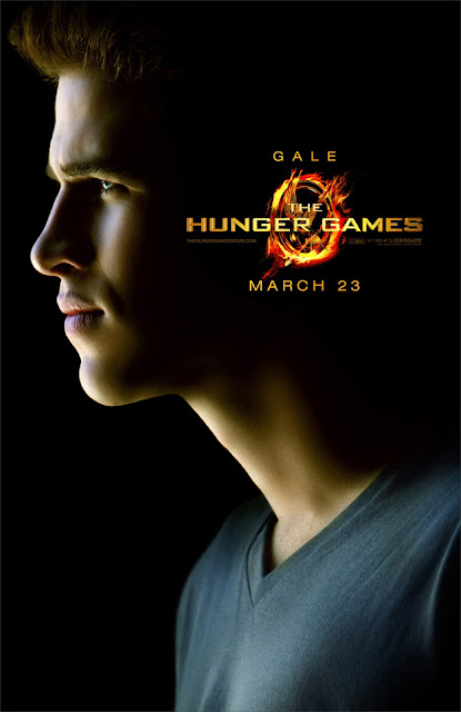
The Hunger Games character poster Gale Liam Hemsworth
The Hunger Games character poster Cato Alexander Ludwig
The Hunger Games character poster Haymitch Woody Harrelson
The Hunger Games character poster Cinna Lenny Kravitz

Clearly Katniss (the protagonist for those unfamiliar) is set apart from the rest in a brilliant and subtle way. Pretty awesome when you can see that the designers of a campaign have really put a lot of thought into it. (When something looks great it's obviously to the credit of the designers; when something looks terrible, it's because the execs made them do it. Right designers?)

I also do like the new logo, only slightly tweaked from the book cover. But at this size, the mockingjay is too obscured by the angle and the flames to even see what it is. They should have chosen one feature or the other, and I'd say the flames. I also wish it didn't look like the title was stabbing Peeta and Cato in the eye.

(So good of those websites with exclusives to put their dirty little watermarks on the images. I'd like to thank the fine folks at Yahoo! Movies, MTV Hollywood Crush, Moviefone, MSN's The Hitlist, and Fandango for not thinking that Lionsgate giving them an exclusive means they own the image. Also to Coming Soon for originally compiling them.)

Commentary that includes SPOILERS after the jump.

Wednesday, October 26, 2011

Go Bully Free

Go bully free, Hollywood: build extravagant impractical housing.


Not sure what Extreme Makeover: Home Edition has to do with bullying, or Hollywood, but I like the composition of this billboard, and I suppose it is a good message.

And don't forget the taco bed. Kids love taco beds.

Monday, October 17, 2011

The Top Ten Uniforms in College Football, Pt. 2

And you thought I wasn't going to finish it.

8. Texas A&M

The Aggies are the first of many teams in this countdown that feature a classic collegiate look, but that's only because that is the best thing there is. Even in the current state of college football uniform design, quite a few teams still choose to stick with tradition (mostly those that win football games), so picking the best tends to ride on a specific quality or qualities that make one team stand out from the pack. A&M looks especially slick when they (rarely) suit up in all-maroon:


But the feature of their uniform that has always stood out to me, and that earns them a spot on this list, is their helmet decal. The design of the logo itself isn't all that special, but just look at the way it dominates the side of the helmet.


It's huge!

Apart from Boise State's terrible one-sided Nike pro combat helmet, it's got to be the biggest in the game.

They do very often run into the problem with chinstraps falling over the logo, though, as seen above. And I could do without the gray outline around the numbers.

On a personal level, I would like wish the Aggies nothing but failure, and may the Oklahoma Sooners send them off on November 5th with an even worse beating than in 2003 (77-0).


7.Arizona

Here's another instance in which the uniforms change so often that it's hard to know what you are rewarding, or in turn, dumping on. Arizona has shown quite a bevy of uniform combos this year:


And those are just the home games. For the most part, these kind of suck. But I just love their all-blue look. Here it is from a year or two ago when they were sporting some unfortunate red piping/striping.


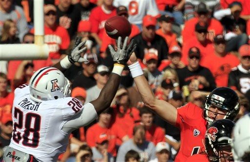
Still, I'd rather that than the new interpretation, which features red-and-white or red-and-blue stripes that fade to white (or blue) in a pixelated dissolve, not unlike a Windows 95 screen saver, on both the pants and the helmets, as you can see on Mr. Parish, below.


But even these can't push the Wildcats off my list, and remain a DISTANT second in the stupid looking pant stripe of the year award.

Coming up next....

A look at how Oklahoma edges out Alabama in uniform design, as well as in winning national championships. (13 is a lie.)

Wednesday, October 12, 2011

The Ides of Smarch


Unfortunately, a few people thought this wasn't a terrible idea, and then a few hundred people had to pretend they were right in order to continue getting paid money. Yikes. I didn't even hate this at first, but it's one of those billboards that grows on you (not in the good way, like a fungus).

Here's the deal, these are two of Hollywood's best man's mans, (Have you seen Michael Clayton? Have you seen Drive?) and somehow the merger of their faces comes off as feminine, and I'm not the only one that thought that.


See? Even @elkress thought that.

I could literally come up with ones of better poster ideas (meaning between two and nine).

Obviously, your first thought goes to the incredible 1993 documentary The War Room, which follows President Clinton's '92 campaign (and also which you can watch in its entirety right here) so why not just go there?


Okay, well I thought the poster would look much cooler than that. But hey, it was the 90's. Still, a pretty good shot of two of the most important behind-the-scenes political figures of the past decade two decades ago, George Stefanopoulos and James Carville. You still could have played on this theme, or if not that, what about these?

  • Some sort of situation room, everyone gathered around a table looking up towards the viewer, sweat on their brows, documents in hand
  • Ryan Gosling lounging on the capital, wearing a top hat, like he's a giant or something
  • George Clooney in a toga (obviously)
  • A moody black-and-white of Clooney and Gosling in front of an American flag. Oh wait...
And yet, this was never seen by anyone.
One thing is certain: this campaign should have done something more to highlight its fantastic cast. Paul Giammati, Philip Seymour Hoffman, Jeffrey Wright, Marissa Tomei, they all got snubbed in favor of a klunky gimmick and yet another terrible photoshop of a hand holding something. (When will they figure out that you can't pose a hand, digitally insert something into it later, and it not look completely unnatural?)

Yikes, again.
Also, a flat image on a curved surface, why is he holding a magazine in front of his face, etc., etc.

You know what you're gonna make me do, The Ides of March? Endorse tiling. That's how bad you are, that some sort of Valentine's Day tiling of acting superstars would have been a better option.


Or what about this?


You got some nuns, some stars. It's not great, but it gets the job done. Instead, we got a George Clooney/Ryan Gosling magazine-face ghost movie poster. The film itself, however, was quality, and if you have the chance to check it out, I recommend it.

The Ides of March billboard photographed by @BenjaminFriday.

Monday, September 26, 2011

ABDUCTION: or, How I Learned to Stop Worrying That Gravity Existed.

Okay, take a look at this.

I know, I'm sorry.
It's actually kind of cool. Sliding down a building, holding a gun, about to do parkour on some girders to escape bad guys (see the trailer, below). They used Helvetica, it's got a tagline that could go for a courtroom drama, and Taylor Lautner has really thick hair. All good stuff.

But what's most importantly, is that his torso isn't bent at all. It's like he's cut in two right at his belly button and then pieced back together. I am certainly no expert, but I'd have to say that we're working with a minimum of three different bodies here: head, legs, and torso. But I definitely wouldn't be surprised if there were more. Apart from that, however, and the shards of glass exploding out from not-broken windows (again, see the trailer), it's not that terrible, right?

And that's when you notice the perspective, or confusing lack of it. Is it from the side, looking east to west, or from the ground, looking straight up at the sky? It's clear from the perspective of the buildings and the shape of the helicopter that we're looking at the sky, but then where or what is Mr. Lautner is sliding toward? Well ya see the thing about buildings is...... but you said...... my brain hurts. Unless they were purposely going Escher on us here, shouldn't it have looked a little more like this humble artists rendition?

Athangyou.
The answer is yes, it should have. I mean, down is still down, isn't it? Did they change what down was and I missed it?

But this campaign isn't too invasive, being completely relegated to our lovely city's massive supply of  bench ads, where it's hard to see the mistakes of the one-sheet.


You guys want to see something really cool though? Watch this trailer for Abduction, and every time Taylor Lautner says a line of dialogue (not voice over), repeat it in your head as accurately as you can. It's hilarious. (Spoiler alert: he's a really bad actor.)


"You wanna play with no rules? You better be careful what you let out of the box."

So, I wrote a screenplay once, and because of that line, I'm gonna go kill myself now. Goodbye, everybody!

Tuesday, September 13, 2011

The Drive Campaign is Simply Brilliant

I'll admit it. I put a lot of negativity into the universe the internet. Come on, I'm the one that tags my tweets #certifiedhater. I get it, I'm negative. But I'm not a cynic. I think lots of things are great. Unfortunately, out of all the great things, few of them are movie billboards.

I've had plenty of requests for more posts on ads that I do like, but to be honest, they just don't come up that often. And even most of the good ones aren't great, they just aren't terrible. However, there are some ads up right now (and not enough of them) that are truly great. Those for Drive.


Incredible.

The problem with great work, however, is that it's difficult to say much about it. To simply list everything that makes it great nearly ruins it. It's usually better to just behold. But if I must...

First and foremost, the title. For this type of movie, it would have been really easy to go with a font like this, or this, or this. Those first two are weak-ass. The third is meh. But this pink script is the not-obvious perfect choice. Juxtaposed against Brian Cranston, Christina Hendricks, and Ryan Gosling's collective H.A.M.-ness, it works perfectly.

The white frame also works wonders, allowing the hot pink script to spill over the image beautifully. The lighting and composition obviously play big parts in the success of these posters as well. However, it would be a stretch to call this unique series "original." These one-sheets immediately conjure thoughts of the 80's that lead not back to the 80's, but to 2006 and Marie Antoinette. A quick search yielded the following image:


Pretty similar. Still, I remember watching that trailer, seeing the hot pink title slap across the 18th century French aristocracy, and being completely impressed by how easily and immediately that put forth Sofia Coppola's thesis: that here was the first brat, the original "me" generation. (Is that right? I actually haven't seen it.)

Not sure what message the creators of the Drive campaign were trying to send, but it looks fantastic anyway. Take a look at some of the billboard images:


If you're a regular reader, you'll recognize LA is not OK's favorite thing: filling the frame without being too busy. It's clean, uncluttered, and so much better than a ton of white space. The tagline is similarly simplistic, and amazingly pun-free. To take it a step further, the first and third of these billboards are truly great because they start to tell a story. Not quite as well as say, The Hangover, but you do get a sense of situation here, an obvious conflict between characters. Also notable is that the star of the film appears in both of these, yet not only is he not the focus, he is hardly noticeable (in the scorpion jacket on top, the chin on the bottom).

Let's take a look at another campaign that did something similar, to show that it is possible to take it too far in the other direction.


These three images went up as billboards all over town for Crazy, Stupid, Love (albeit in English). They also start to tell a story, but a disparate one that without the context of the narrative, is less intriguing than it is confusing. Take the first of the Drive billboards. You think, they're getting onto an elevator, but there's going to be trouble. Now look at the Questo E Folle image. You know the sex fiend is going to bang the scared man, but especially in combination with the other two images here, as well as this, you have no idea what the tone of the movie is supposed to be. If you've seen it, you know they missed the mark. This campaign was actually on the higher end aesthetically, but the comparison to Drive shows just how solidly the former nailed it.

Unfortunately, Drive's main one-sheet is probably the weakest of the lot.


Still, even this poster *puts on sunglasses* is miles, ahead of the competition. YEEEAAAHHH!!!

Friday, September 2, 2011

The Top Ten Uniforms in College Football, Pt. 1

The first thing you have to be aware of when compiling a list of the top ten uniforms in college football, is that for many teams, they change constantly. That makes dictating a definitive list difficult. Most of the best uniforms in college football belong to those tradition-rich schools that don't often change their branding, but that's not always the case. To quote Billy Costigan quoting Nathaniel Hawthorne, "College football uniforms are always rising and falling in America." Or something like that. I've noticed three basic trends in college football uniform design right now: some, like numbers nine and ten in this countdown, are moving from a modern look filled with various accoutrement, to a classic, cleaner look. Others go simply from one fat stripe and weird piping to another: the natural, inch-by-inch progression of broad trends in design. And still others have decided to eschew all good sensibility and instead drum up publicity for their program by going bat shit crazy. Got a perennial 7-5 team, ever on the cusp of breaking through to the next level? The answer's simple: wear a lot of stupid ugly uniforms. It worked for Oregon.

Also before getting into the countdown, I'd like to point out that my roommate has pointed out, somewhat with disgust, "I have never met anyone who talks about uniforms as much as you do." What can I say? I LOVE college football. And though my favorite part is when Ronnell Lewis runs into someone so hard that it sounds like their spine broke, I can also get excited about all the design elements that go into the game. Besides, my roommate only said that because he's never read Paul Lukas' utterly genius Uni Watch column on ESPN. That guy gets me, and makes me feel less weird about obsessing over uniform design. Lukas also has a personal Uni Watch blog, but I find it to be only slightly less tl;dr inducing than The New Yorker. Although I produced my list before reading this year's listing of every uniform change in the FBS, I'll be linking to some of Lukas' pictures, and I'm generally indebted to him for his awesomeness.

And without further ado, A-WAY we go!

10) Colorado

In the last few years, Colorado's uniforms haven't been anything special. A few years ago, they even suffered a bit of controversy for these for adding some textured whatchamacallits to their shoulders.


The fear was that they were somehow engineered to cause tacklers to slip off ball handlers, but to me they looked grippy, if anything. Anyway, they proved in whichever way that they provided no advantage, and wore them from 2007-2009, I believe. (Research showed that they definitely didn't have them in the 2005 Big XII Championship; results for the 2006 season came back from the lab inconclusive.)

Then, in 2010 (and I didn't even notice this until today!) they switched over to a more classic home jersey, dropping the shoulder grips, the gold piping, and the gold outline around the numbers, and changing the Colorado script to a large white font that matches the new large white numbers.


They also added some retro-looking shoulder stripes, moving the numbers from the side of the shoulders to the top. I think they look pretty slick. Much better than the last few years. Uni watch pointed out that one long-time problem for Colorado is that their helmets didn't match their pants. According to this picture, a comparison put together by Uni Watch, they've fixed the problem for the upcoming season. More than enough improvement to warrant a spot at the bottom of this list.

9) Boston College

Another team that would not have made this list before I read this year's Uni Watch. What used to look somewhere between terrible and average:

NEEDS MORE THINGS
Now looks pretty fantastic.


They've ensmallened the numbers and removed the italics (a.k.a. made them legible), dropped the numbers from the shoulder as well as the eagle patch (which was itself only added a few years ago), and added a white stripe on the helmet (which I think looks good, but the fans seem to hate). I still can't tell what's on the shoulder, if anything, nor can I find any other pictures of the new digs. The answers will come this Saturday, but they're still clean as hell and I love 'em.

Up next.... teams 8 - however far I get!

Wednesday, August 24, 2011

TV: The little brother of a real industry

For some reason, someone put TV billboards up where all the movies billboards are supposed to be.


HOW TO BE A GENTLEMAN


They should have called this show "Drama and the Nerd Guy." How amazing would it be if this was a legitimate Entourage spin-off starring Drama? Either way, Kevin Dillon seems cursed (blessed?) to play that character from now on. And look at what a slob he is! He's eating a burger! Also, in case anyone missed it, the tagline is "Prude Meets Dude." Many many people were paid American currency in order for you to read those three words, so in case you ever needed proof that we live in a fallen world, there you have it.

This is literally the pitch from their website: "Bert's a man's man, Andrew's a gentleman. This fall they will teach each other a little bit about becoming a better man!" Man I wish I had made that up as a joke man, but sadly I didn't man. Read that again in Trey Parker's voice and tell me it doesn't sound like a line from a sitcom parody on South Park.

Also hilarious is the fact that they have a forum, and as of the writing of this post, it's completely empty. However, such topics of discussion (posted by "CBS Administrator") include: "Modernization of the Odd Couple" and "Tie wipe!"

THE PLAYBOY CLUB


This of course (along with Pan Am) is to Mad Men what Supernatural/The 4400/Flash Forward/Fringe were to Lost: knockoff shows that rode the coattails of a huge hit......into ultimate obscurity. But as far as advertisements go, this is probably my favorite of the bunch. It's colorful (you know I'm a sucker), fills the frame nicely, and the tagline, "Don't let the fluffy tails fool you," doesn't even make me want to puke. I would even considering watching this show, if I didn't think that Pan Am was likely going to do the same thing only better. Also if it wasn't about the Playboy Club.

PERSON OF INTEREST

Someone send me a better picture of this please.
Not a great ad, but probably the show with the best chance to actually be good. Lots of quality talent behind this one. For anyone not familiar with our major players, we have:

-Star, Michael Emmerson: Played Ben on Lost. If you happened to have missed Lost, congratulations! You're probably still thinking, "Man, I really need to catch that on DVD." I am here to tell you that in fact, you do not. Let's put it this way. It was about 20% really good television, 30% anus-clinching anticipation, 10% whyTF didn't you even mention the last episode's cliffhanger, 20% really lame television, and 20 more % heartbreaking disappointment. Instead, just start watching this show and hope for the best. Or start Mad Men on Netflix: Watch Instantly.

-Star, Jim Cavizel: Most famous for playing Jesus, but was also excellent in the truly underrated The Count of Monte Cristo. He was also on another show with a great pedigree that ended up failing miserably: The Prisoner. That also starred Ian McKellen and aired on AMC, the network "that can do no wrong," because they know you don't remember the series The Prisoner that only ran for six episodes.

- Executive Producer, J.J. Abrams: Is there anyone out there who's still not "eh" on J.J. Abrams yet? Get there. He's not great.

-Executive Producer, Jonathan Nolan: Brother to Christopher Nolan and co-writer of The Prestige, The Dark Knight, and the upcoming The Dark Knight Rises (which by the way takes place eight years after the events of The Dark Knight, and no one else knows that yet, so this is also a gossip blog now).

PAN AM


Look, he owns Pan Am; he owns Congress; he owns the Civil Aeronautics Board. But he does not own the sky!

Christina Ricci! Normally I'm saddened when film stars I like do television, because I think it's a lesser medium, but for some reason there's less of a stigma about that these days than there used to be. Television somehow no longer means that an actor's career has tanked. What is with you people? Go see movies. Not now, of course. Go see the good ones during Oscar season you idiots. Emily Cox told me she finally saw Black Swan on DVD a few weeks ago. You have good taste and are culturally relevant, you have no right watching Black Swan on DVD nine months later. Sheesh. But anyway, I really like Christina Ricci, and unlike many film stars currently making the transition (huh?), she actually hasn't done anything substantial in some time. Speed Racer in 2008? Could you call that substantial? If this does give her career a jump start, then I'm all for it.

Otherwise, and knowing nothing about the show except for what I've seen above, I'm going to have to give Pan Am my Lock of the Season. And, though it's rather boring, I actually quite like this billboard. It's well balanced, the background isn't white but the color of an aged sheet of paper, and I think it was a great move to use the traditional company logo as the show's own. Also, whether it's because of historical, cultural, or visual cues, how cool is it that at a quick glance these women look sexier than most of the models in your average racy designer billboard, all while being covered nearly from head to toe?

NEW GIRL


Someone snap a pic of this billboard and send it to me.
Wow. Barf everywhere. Not enough time to talk about how bad this is. She looks like she's in pain. She looks like her new fiance just made a really racist joke in front of her family. She looks like a Barbie you just dug out of a suitcase full of old Barbies.

You don't have to beat us over the head with the fact that Zooey Deschanel is this quirky indie girl, we all know that Zooey Deschanel is this quirky indie girl. But this isn't even a good Zooey Deschanel! This is more like some girl in Bismarck, North Dakota, who is like the cool indie girl of Bismarck State College, and she walks around thinking that she is the "total Zooey" of BSC, but everyone else thinks, "Look at that wang. Who does she think she is, Zooey Deschanel?" Doesn't the total Zooey know that Zooey Deschanel doesn't walk around in a sleeveless lime green turtleneck dress with really bad hair? Except now she does, apparently.

Also, the tagline is "Simply Adorkable." For quite a while I thought this said "Simply Adorable," and my line was going to be, "Can someone show me who to simply kick in the dick for that one?" Then I saw it was actually "Simply Adorkable," and now I'm at that point where...you know how sometimes you move past anger and just give up?

UNFORGETTABLE


Quality of image relative to quality of show.

I know this is the obvious line, but strange how this billboard, and I'm sure the show to follow, is instantly forgettable. The blurry tagline, "She can do anything but forget," leads me to believe that she's some cop with an outstanding memory or whatever, who really cares (oh yeah, the 50-to-dead demographic). Only two new shows stand out as more forgettable than this: that weird Medicine Special Mind one or something (you know the one, the one with that actor), and Cop Out, or Cop something. The tagline is "Cop. An Attitude." and it's got this butch cop woman on it. If there were any more forgettable then these, it's because I have actually forgotten them.

THE SECRET CIRCLE

The guy on the far left is like the Superman of being attracted to guys. 
This is just the worst. Except New Girl. New Girl is the actual worst.

RINNGER


And here we have the worst design work of the bunch (save maybe The Lying Game, from which I will spare you). Even at first glance, even from a large distance away, this looks nothing like a believable reflection. It's as if they wanted it not to look like a believable reflection. The bus ad is even worse.


That arm! How long is her arm?! If you embiggin and take a look at the finer details, we see that SMG's chin and eyes seem to line up, but that her nose and mouth oddly do not. That's because in the image on the right, her head is tilted down slightly, and some compositor forced with the task of making these two images appear to line up sat at their computer with furrowed brow, not unlike a small child struggling to mash together two similar yet incorrect puzzle pieces. Also, in the "reflected" image, her hair seems not to pulled back behind her ear. But most of all, her shoulder just DISAPPEARS in the reflection! Where is it? Tell me. Furthermore, the reflected image shows her clearly facing forward, where in the image on the right, her head is turned dramatically to the left. Again, it's like they didn't even try. It's insulting. At first I didn't care because this show is so obviously going to fail. But if you're going to make me look at this all over the damn city, at least show me the common decency of giving me a shoulder reflection, you know?!
Saturday, July 9, 2011

YOUR DESIGN HAS NOT BEEN ADJUSTED

In fact it's been pretty much copied outright.

This,
equals this.
How did I not see this before?

Who can tell me? When did the giant tagline over the face trend really start?