Thursday, July 7, 2011

IT ALL ENDS.......or does it?

You guys I can't wait for this movie coming out on July 15 called It All Ends. It looks so sick.

Sick, right?
Can you guys even wait to see It All Ends?

So, a mere matter of weeks after I write a post about how novel the latest Pirates campaign was for not advertising the title of the movie, we get not one, but two different campaigns advertising without a title. The first of course is Harry Potter and the Deathly Hallows Part 2, aka "That's still going on? Hmm, all right." The other, Transformers: Dark of the Moon.

And here they both are, together, mocking me, sans title.

Dicks.
Again, if you have the brand recognition, your title is five, seven, or eight words respectively, and if theater goers stopped caring a long time ago anyway, then why bother with a title? I think both these campaigns look great.

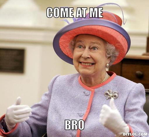
Transformers, with its "come at me bro" robot cars:

These look great when they expand from the billboard.

And the everything-just-exploded-everywhere Harry Potter posters.

You guys, It All Ends.
IT. ALL. ENDS.
It all ends you guys.

If only I could believe that were true.

(All original photography by Ben Friday. Thanks Ben!)

Tuesday, June 21, 2011

riends ith enefits

Can we really hold it against Friends With Benefits that another movie with pretty much the same plot came out just a few months ago?

Yes. Of course we can. Other things we can hold against it:
  • The tagline "It's Harder Than It Looks."
  • The dateline(?) "Get Some JULY 2011."
  • Justin Timberlake (why not?)
  • The fact that Mila Kunis still feels like a side character, even though I'm pretty definitely sure she's starring in this one.
  • And the terrible red-on-black lettering used for the title:
Mommy? What does "riends ith enefits" mean? --Close your eyes, honey.
Which used to be a very legible light blue-on-black color scheme (that has not been used in any advertising whatsoever).

My elbow is inside your neck.
Also Justin Timberdale's tie. What's going on in this scene? He's getting undressed? She's obviously not? I don't know.


There, that's a little clearer. See, in case you didn't know what "friends with benefits" means, they've gone ahead and explained the situation visually. In this diagram, Justin Timberdell's index finger represents his erect penis, while the circle Mila forms with her thumb and forefinger takes the place of her willing vagina. In theory, the two will meet in the act of sexual intercourse, even though, get this, they're just friends. The "benefits" referred to in the title are that they get to have sex with each other. If anyone is still confused, please visit the Wikipedia entry on casual sex.

Oh, another thing I have against this campaign, Justin Timberderr's scarf in this image for Bad Teacher, which has been appearing on the side of many Los Angeles buses in the last week or so:


"Wait a minute, are you trying to tell me that you're going to complain about Friends With Benefits because its star wears an article of clothing you don't like in an ad for a COMPLETELY DIFFERENT MOVIE?!" you ask?

Yes, I am. I do what I want.

Wednesday, June 15, 2011

Please, don't take Pops to Popper's.

This billboard for Mr. Popper's Penguins, although quite blurry and poorly composed, actually says, "FATHER'S DAY WEEKEND, TAKE POPS TO POPPER'S."


This is the opposite of an advertisement for a suicide hotline.

Tuesday, June 14, 2011

Super 8: A Review - by Garrett Baker and Blake Dilliner

  
Presented for you, completely unedited (meaning don't judge us for saying "like" so much), is a conversation between me and Blake Dilliner about the film Super 8. Attention - *MAJOR SPOILERS* follow - don't read this if you haven't seen the movie and still want the chance to be let down by the third act.

Blake:  fsu highlights are super mint
i forgot how much o fa beat down that was
me:  So mint.
Blake:  i hate jj abrams more every day
me:  lol 
Blake:  i think he's my least favorite director
me:  yeah i really grew to dislike that movie more the few days after i saw it
Blake:  after tyler perry
me:  wow
i think mine still has to be tony scott
Blake:  yeah i like hate super 8 3 days later
lol
me:  i don't hate it, i'm just like, that pretty much sucked
Blake:  yeah

Monday, June 13, 2011

Gretchen, stop trying to make 'fetch' happen.

This is a little late, but as far as the billboards went, I thought the ad campaign for The Hangover Part II was quite good. A few different variations on this theme. I'm in a bathtub with my clothes on, I'm lying on the floor, my head is shaved, there's a monkey with a denim jacket on, can you not see how crazy we are? The campaign did some of my favorite things: filled the frame without being too busy, utilized actual photos (or were good enough photoshop jobs that I couldn't tell the difference), and also used some really cool lighting schemes.

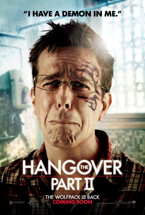
However, let us take a look at the character posters for THP2, which I mostly saw on bus stops:


Aside from a strange Sixth Sense-esque lens flare behind each of their heads, they're still good-looking posters. But...what are those quotes doing up there? They're not taglines. That's still "THE WOLFPACK IS BACK," hanging out down there beneath the title. These are clearly lines the characters say in the movie, 'cept one thing, we haven't seen the movie yet. You can't prequote your own movie! Don't tell me what lines in your movie are funny. I'll decide that, when and if I see it (I haven't and don't plan to).

Think of your favorite quote from any movie......... Now imagine that quote had been on the poster for that movie, and how much that would cheapen it. These obviously aren't the best lines from the film, but still, don't push your quotes on me. Don't try to make 'fetch' happen.

What if the Billy Madison poster had shown a close up of Billy with one of the film's lesser quotes over his head? Something like, "Man am I glad I called that guy." No matter what quote you used, it would automatically be the lamest line in the movie.

Unfortunately, this isn't the first time I've seen prequotes used. Exhibit B:


Remember when I Love You, Man came out, and then everyone was calling each other "Dude von Dudenstein" all the time? No? That's because it didn't happen. (I actually do hear people say "totes magotes" or simply "totes" every once in a while. Aaaaand I always look down on them for it. You said that because a poster told you to. And it's not even funny.)

Let's just hope we're not seeing another tagline-over-the-face-type trend forming here.

Monday, May 23, 2011

My Highest Ad Campaign Rating Ever: Not Terrible

I've been under pressure lately to blog about some billboards that I actually like. Wha--? Me? Negative? As my father often exclaims to express his disbelief, "The hell you say!"

Actually, a few gems have caught my eye in the last few weeks, the nearest release of them being the next chapter in the popular "Pirates" series, Pirates of the Caribbean: Something About Mermaids or Some Bullshit.

I truly do prefer to discuss billboards, as opposed to posters (or 'one-sheets,' as we call them in the biz), because what interests me is not the design of a single poster, but the entire print advertising campaign a studio decides to put forth. I am not usually able to find images of billboards, but in this case I was able get the one most often used in the PotC: OST campaign.

Click to embiggen.
A nice smattering of piratey motifs, no? Let me start my first 'good' review by expressing that I am not a designer, I have not taken any sort of visual arts class since high school, and that I can only tell you what appeals to me personally. That said, I do like this. This billboard does one of my favorite things: filling the frame without being too busy (other good examples include the billboard versions of The Legend of the Guardians and Transformers: Revenge Blah Blah Blah, as well as these for Yogi Bear, which certainly push the 'too busy' line, but I think they make it work). As you can tell, I also like color. This campaign has a good scheme going and narrowly avoids the orange/blue contrast so prevalent in film advertising, opting instead for the daring yellow/blue.

Another thing I like about this one: no tagline, no title. Very few films have the brand recognition to advertise sans title, and if they do, will often stick to the number of the sequel in the franchise's trademark font. Seems like half the movies that come out these days are titled simply "2" or "3" <-- (lol). On Stranger Tides is a 4, and for advertising purposes has decided to forgo a title altogether. On TV spots for this film, you'll only hear it referred to as "Pirates of the Caribbean." (By this point, many franchises do attempt an in-series reboot by dropping the number and returning to the original title. See: Fast and Furious, THE Final Destination, Rocky Balboa, and Rambo.) What we get instead is a skull and crossswords, but you don't really need anything besides Captain Jack, who is probably the most recognizable original character since Darth Vader (or is there another?).

The one-sheets for PotC: OST are much more derivative, but still, not terrible. Except for this giant skull, which was featured on Disney's exclusive spot on the side of the Westwood Medical building, it's all character posters.


Jack,


Jack,


Penelope Cruz as some girl with swords,


And I actually did see this mermaid on a bus stop.

Click through to see how stupid these scales are.
Can anyone tell me what's the deal with the fact that her scales crossfade into skin?! What kind of freaky mermaid is that? If you touched the part that's half scales/half skin, what would that feel like? I mean, I can see going for some type of transition between skin and scales, where it's like scale-ish skin, but to go for a straight up visual fade between the two? I'm sorry, is this West Handkerchief High School's AV club or Walt Disney Studios and one of the most successful franchises of all time? Put your back into it a little bit.

Also, what's the deal with mermaids always having knees? That's ridiculous.

Thursday, May 19, 2011

I honestly can't decide what I hate most about this.

Sometimes you think you've reached your capacity for hating a certain thing, say, the movie Zookeeper after seeing a TV spot for it. Then something else comes along to make you realize, no, you have much much more capacity to hate that thing, say, this poster.

This is an image of Kevin James riding a roller coaster with a gorilla.
My, what harsh shadows are cast on the roller coaster's yellow harness, yet what soft light has fallen on the zookeeper and his gorilla! So, I don't want to become the "bad photoshop guy," in fact, I don't even know how to use photoshop. Seriously though, you guys know that it's better if your poster doesn't look like complete shit, right? Compared to the shadows on his hands, his chest and face look like a cardboard cutout! Also there's a gorilla riding a roller coaster.